
Warmer blues, softer pinks and beautiful, liveable neutrals. I was invited to preview Little Greene’s new colours ahead of their official launch, and there are some absolute beauties.
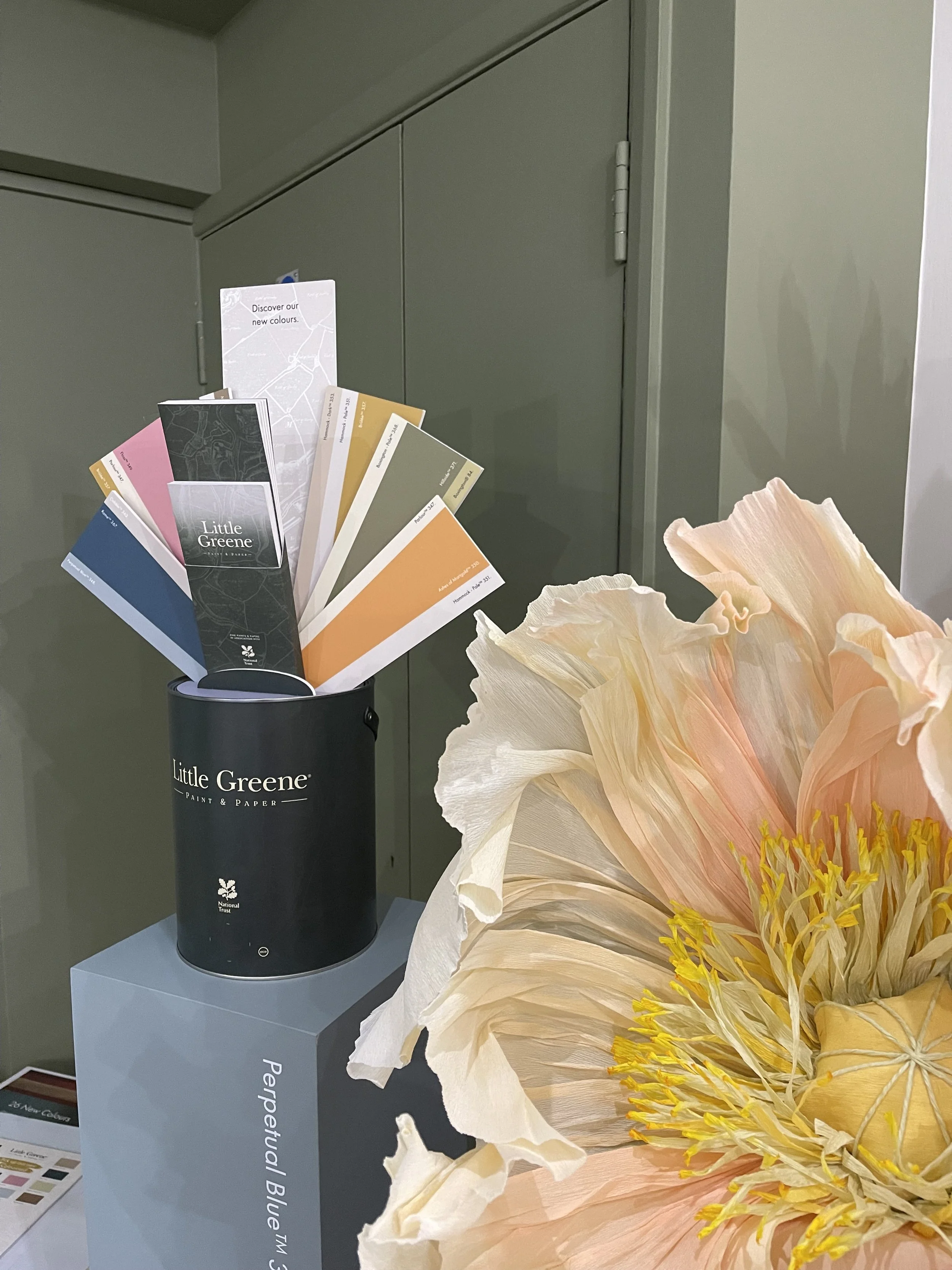
A first look at Little Greene’s new 2026 colour card during a private preview at the Notting Hill showroom.
I was lucky enough to be invited to Little Greene’s Notting Hill showroom for a sneak peek at their new colour card before it officially launches, and obviously I was in my element! Twenty-six new colours, beautiful wallpaper and a morning spent talking about colour. What’s not to love?
What really interested me was hearing about the direction Little Greene are seeing colour move in. Warmer tones, less intensity and softer, slightly more muted colours. And I have to say, this made me very happy because I’ve always loved warmer colours. Even with blues, I’m naturally drawn to the warmer versions, and the same goes for greens, pinks and neutrals. For me, they’re simply lovely to live with and help make a home feel welcoming rather than cold.
So I didn’t come away thinking I needed to change the way I use colour. Quite the opposite. I came away thinking, brilliant, I’ve got even more gorgeous colours to choose from!
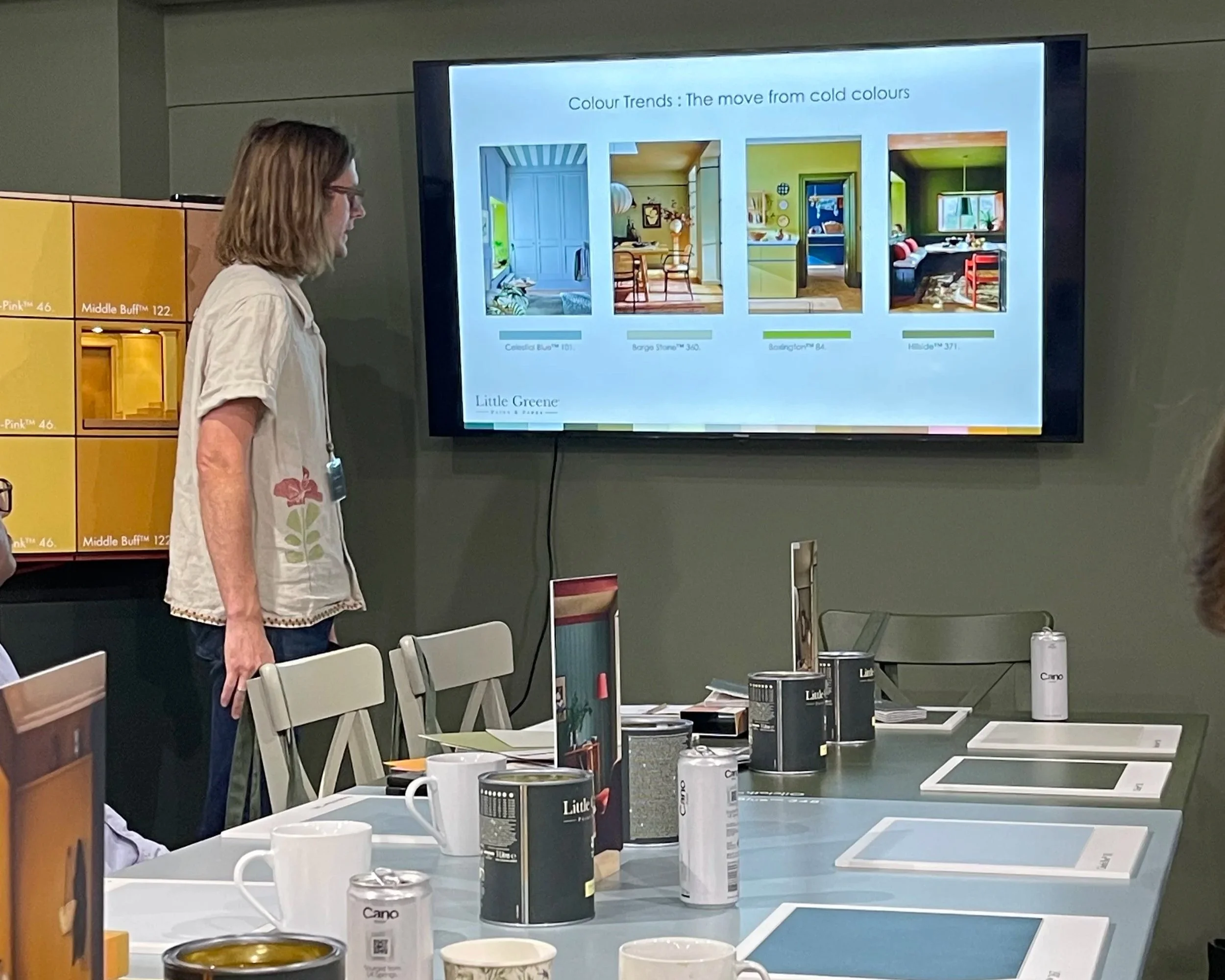
Little Greene discussing the move from cooler to warmer colours during the preview of its new 2026 colour card.
Warmer, softer and easier to live with
I’m always a little wary of talking about colour purely in terms of trends. I would never suggest changing a room you love simply because someone has suddenly decided a particular colour is “out”. Your home needs to feel like you, not like everyone else’s.
When I’m working with clients, I start by asking how they want to feel in their home and which colours they’re naturally drawn to. We might start with a favourite piece of artwork, a fabric, a treasured piece of furniture they already own or simply a colour they’ve always loved. From there, we can build a palette that feels personal to them.
What I do find interesting about colour trends is seeing how palettes evolve and the new choices that gives us. Little Greene talked about a move away from cooler colours and towards shades that are warmer and slightly less intense. That doesn’t mean less colour or that we all need to start painting our homes beige! It’s more about beautiful, nuanced colours that still have plenty of personality but are lovely to live with.
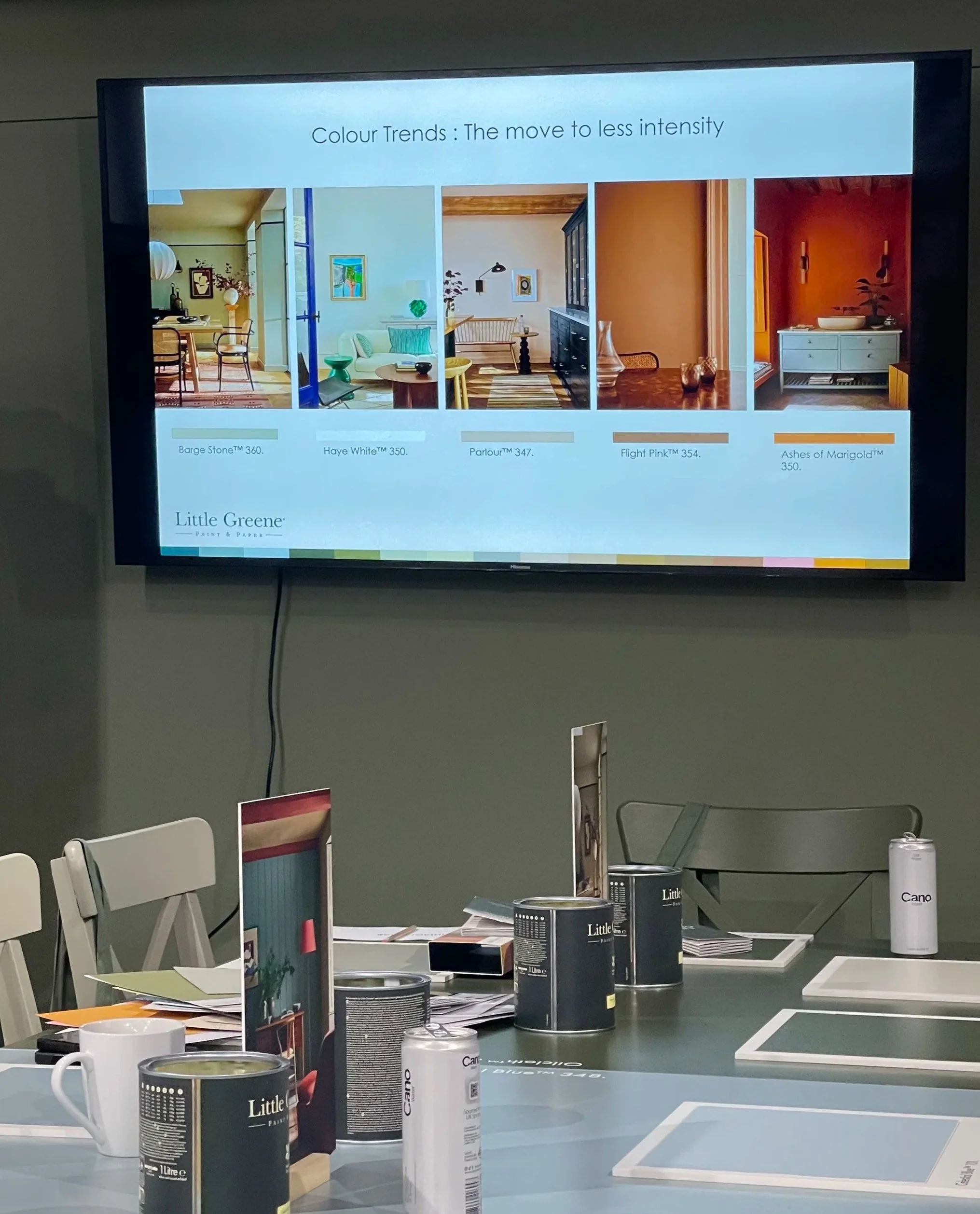
A look at Little Greene's move towards softer, less intense colour, including warmer neutrals and pinks.
The blues and pinks immediately caught my eye
It probably won’t surprise anyone that I headed straight for the blues! I’ve always loved using blue in interiors, but particularly warmer blues, so I was really excited to see the Celestial Blue palette being expanded.
One of my favourites is Perpetual Blue. It has a slight green quality to it that I love and sits beautifully within the Celestial Blue family. This is exactly why I don’t think we can simply say that blue is a “cool” colour. The undertones make such a difference to how a colour actually feels once you put it into a room, and the expanded palette gives me even more of those gorgeous warmer blues to work with.
Blue is such a versatile colour. It can be calm and restful, but it can also be rich, colourful and full of character. If you’re a fellow blue lover, you can read more about why I use it so often in interiors in my The Beauty of Blue blog.
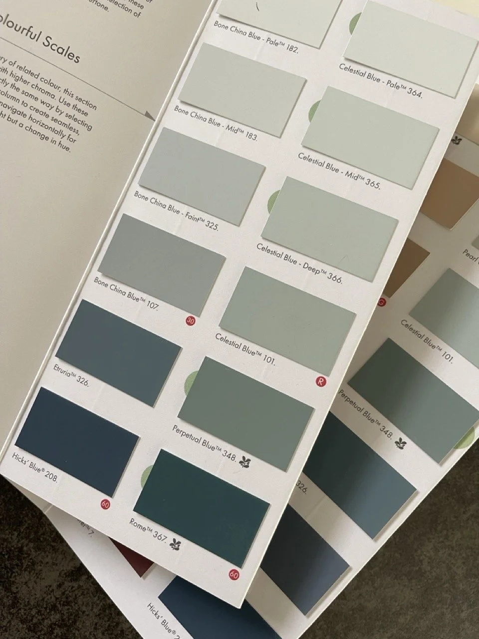
Little Greene’s New Celestial Blue Family
And then, of course, there were the pinks. Anyone who knows my work will know I have a bit of a soft spot for pink!
Parlour and Floss were two that immediately caught my eye. Parlour is a lovely soft pink, while Floss is lighter and softer than the much stronger Carmine. It’s still definitely pink, but it feels really usable, and I can already imagine it looking absolutely gorgeous on woodwork, cabinetry or furniture.
That’s what I like about some of these softer shades. Using colour doesn’t necessarily mean putting a strong colour on all four walls. Sometimes it’s the unexpected little hit of colour on the woodwork, ceiling or a piece of furniture that makes a room.
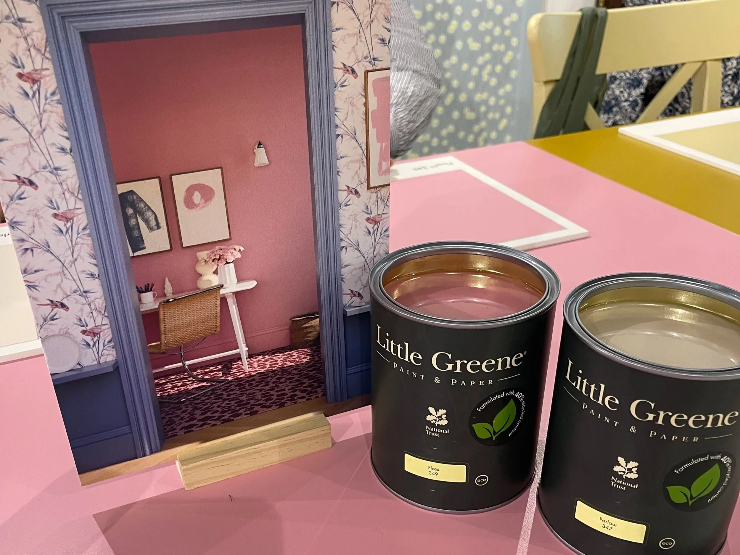
Little Greene’s gorgeous new pink paint called Floss
How I used the new colours in my own moodboard
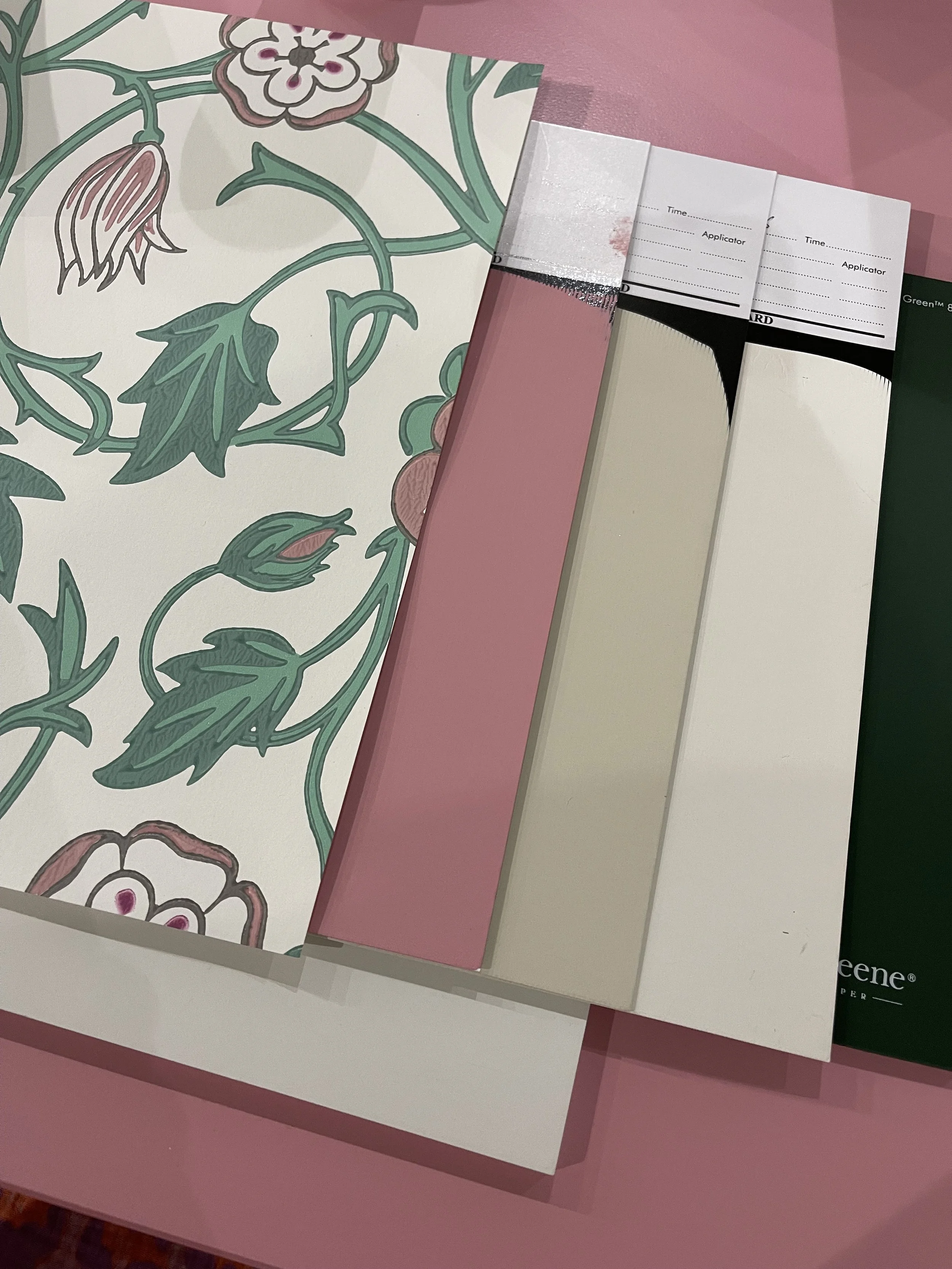
My moodboard created at the Little Greene new colour preview, combining a bold wallpaper with warm neutrals and the new Floss pink.
Of course, when we were let loose on the wallpaper and paint samples to create our own moodboards, I wasn’t going to choose the safe option! I went for a gorgeous, fairly bold wallpaper and then used warmer neutrals to calm everything down, with a pop of the new pink.
I could see Floss on the woodwork, Hammock Pale on the ceiling and perhaps a piece of furniture painted in Hammock. There’s quite a lot going on when you list it like that, but together it works, and that’s something I talk about with clients all the time. Using colour doesn’t mean every single thing in the room has to shout. If you’ve chosen a fabulous wallpaper, let that be the star and allow the other colours to support it.
Equally, ceilings and woodwork don’t automatically have to be white. Looking at the walls, ceiling, woodwork, furniture, fabrics and wallpaper as one complete palette can make a room feel so much more considered. It can actually give you the confidence to use more colour, because you’re thinking about how everything works together rather than choosing each element in isolation.
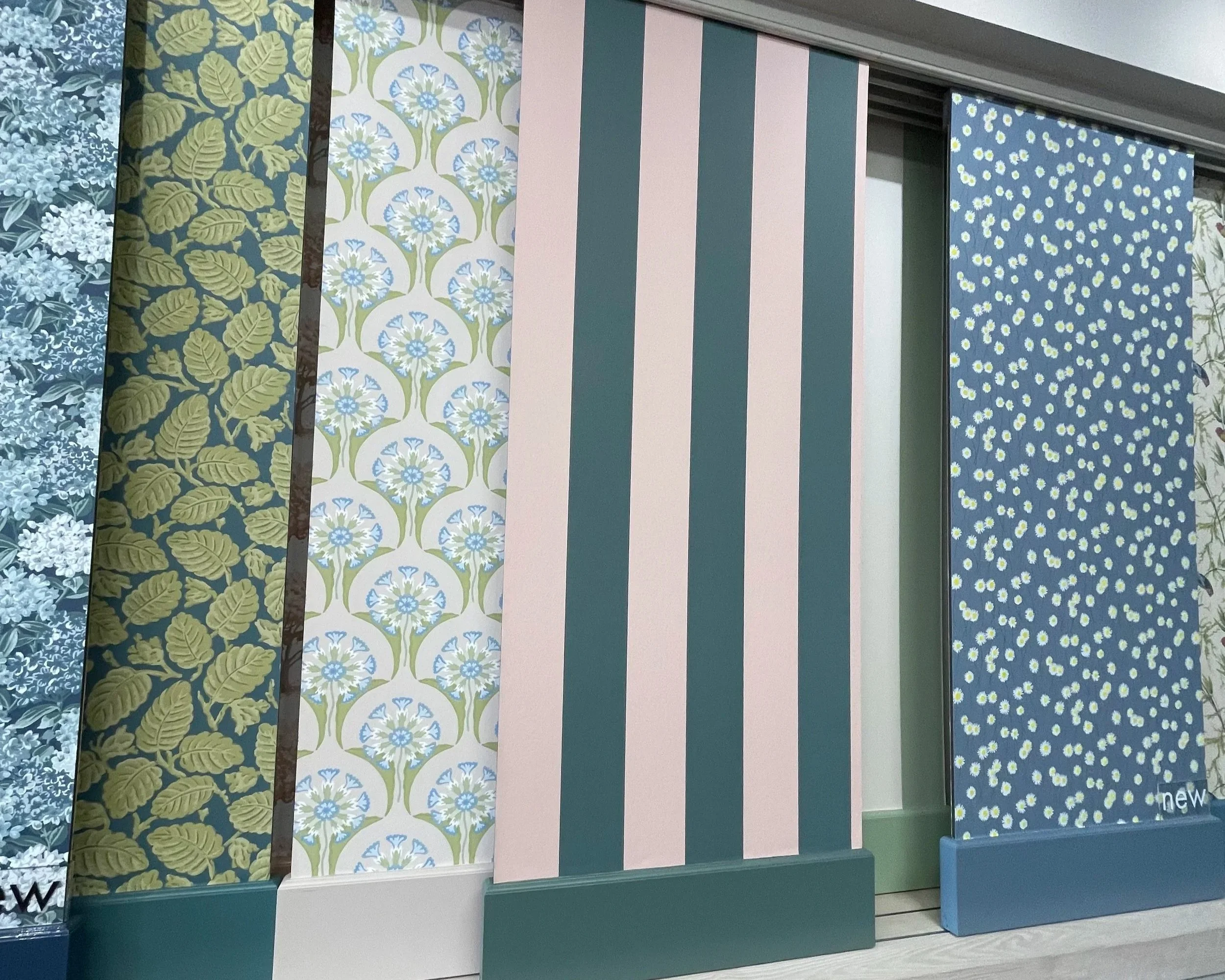
A selection of Little Greene wallpapers at the Notting Hill showroom, showing how pattern and colour can be combined to create a more characterful interior.
Warmer certainly doesn’t mean beige
I think this is one of the things I liked most about what I saw. A move towards warmer and softer colours absolutely doesn’t mean we’re all heading back to beige rooms. There were beautiful blues, greens and pinks alongside warmer neutrals, and it’s the way you combine those colours that makes them exciting.
I love using neutrals, but I’ll often use them to support colour rather than instead of it. A warm neutral can make a blue look even more beautiful. A softer green can sit brilliantly with pink. And a strong wallpaper can feel completely at home when you give it some quieter colours around it.
If I had to pick my favourites from the new Little Greene colours, I’d be reaching for Perpetual Blue and the expanded Celestial Blue palette, along with Parlour and Floss. No great surprises there. Give me beautiful blues and pinks and I’m happy!
More importantly, these are colours I can immediately imagine using in real homes. They’re not just lovely colours on a paint card. I can picture the rooms I’d use them in, what I’d put with them and how I’d carry them through a scheme. And that, for me, is what makes a new colour exciting.
You can explore the new colours and Little Greene colour card on the Little Greene website.
Feeling inspired to use more colour at home?
With so many beautiful colours to choose from, it’s very easy to become overwhelmed. Which blue? Which pink? What should go on the ceiling? Does the woodwork need to match? Will that gorgeous colour you saved on Pinterest actually look the same in your room?
Before you start worrying about any of that, there’s a much better place to begin: how do you want your room to feel?
Not what colour is fashionable or what everyone else is painting their house. Think about how you want to feel when you walk into that room. That’s always my starting point, and once you understand that, it becomes much easier to create a colour palette that feels right for you and your home.
Because the best colour palette isn’t necessarily the newest one. It’s the one that makes you happy to come home.
Happy homes make happy people.
Want to feel more confident choosing colour yourself?
If you love colour but find putting a whole palette together tricky, my Colour Me Happy online course is a lovely place to start. I’ll help you understand the colours you’re naturally drawn to, how to put them together and how to create a colour palette that feels right for you and your home.
Or would you rather have my help?
If you’d prefer to sit down together and work out exactly what your home needs, my Interior Design Consultation gives you two hours of one-to-one design advice. We can look at colour alongside your furniture, layout, window treatments, lighting and all those other decisions that need to work together, so you come away with clarity and confidence about what to do next.
