
This week I had the absolute pleasure of being invited to Little Greene's Notting Hill showroom for a private preview of their new colours, ahead of their official launch on 14th September.
For someone who loves colour as much as I do, this was a bit of a dream morning! We were given a fascinating behind-the-scenes insight into the paint industry, how colours are developed and refined, and just how much work goes into getting a colour just right. We also had a moodboard session and, of course, got a sneak peek at all 26 of the new colours.
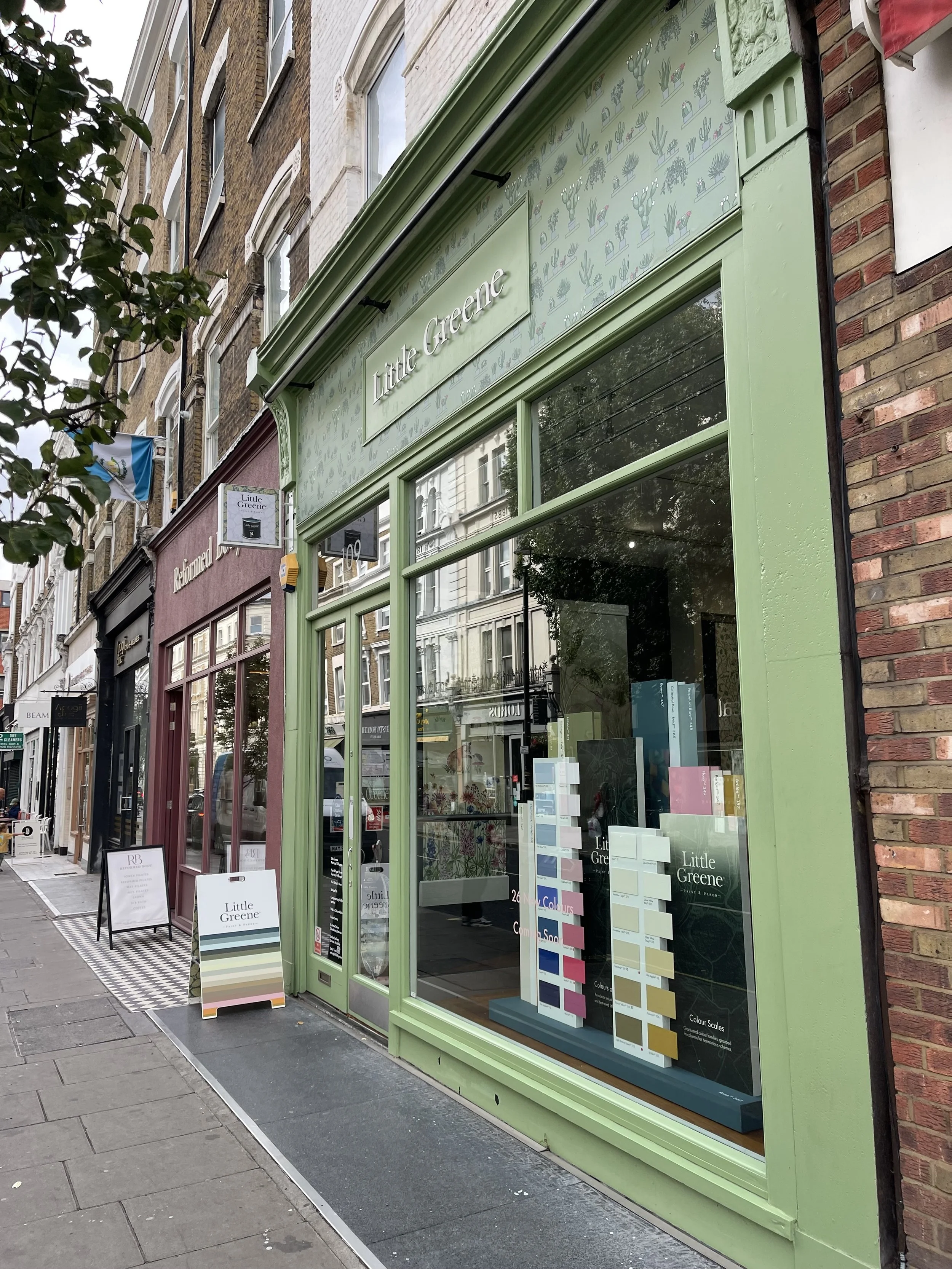
Little Greene Showroom Event
I can't share too much about the colours just yet, but there are some gorgeous pinks, blues and greens that are very much up my street. I already know there are a few I'll be recommending and using in future projects.
One of the things I found particularly interesting was hearing about the move towards slightly warmer, earthier and more desaturated colours. It got me thinking about something that comes up with my clients all the time: are we playing it too safe with colour in our homes?
Because being braver with colour doesn't mean you need a bright pink sitting room or an emerald green kitchen. It's about understanding which colours make you feel good and then having the confidence to use them.
How do you choose the right colours for your home?
This might surprise you, but I don't usually start with a paint chart, and I definitely don't start with what's currently trending.
When I'm working with a client, one of the first things I want to understand is how they want to feel in the room. Do they want their sitting room to feel cosy and cocooning? Their kitchen to feel uplifting and sociable? Their bedroom to feel calm and restorative? Perhaps they want their hallway to make them smile every time they walk through the front door.
That's always my starting point because colour has such an impact on the way we experience a space.
Then I look at the colours they're naturally drawn to. Quite often, the beginnings of the perfect colour palette are already sitting somewhere in their home. It could be a favourite piece of artwork, a beautiful rug, a chair they've had for years, a patterned fabric or simply a colour they find themselves choosing again and again.
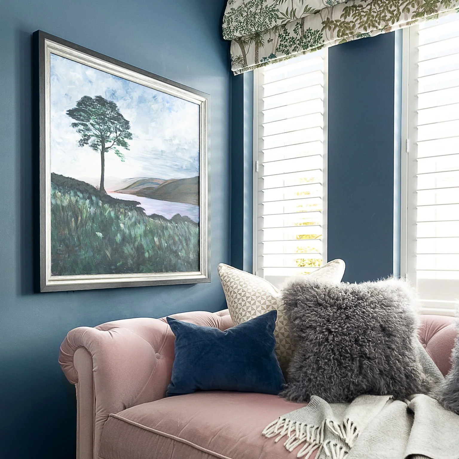
Deep blue and soft pink are one of my favourite combinations. The rich blue creates a cocooning backdrop, while the blush pink sofa, botanical fabric and natural tones soften the scheme and keep it feeling warm and inviting.
Rather than imposing a particular 'look', I use those clues to start pulling together colours that feel personal to them. After all, your home should reflect your personality rather than somebody else's Pinterest board.
Using colour doesn't mean having a really colourful home
I think this is one of the biggest misconceptions about colour. Being braver doesn't necessarily mean painting your sitting room bright pink or your kitchen green.
Sometimes it can simply mean moving away from the default brilliant white or cool grey and choosing a beautiful warm neutral instead. Soft stone, putty, plaster and earthy tones can give you all the flexibility you want from a neutral, but with so much more warmth and personality.
They're also a brilliant starting point if you're nervous about colour. Use a warmer neutral as your backdrop and then bring in colours you love through artwork, furniture, curtains, cushions and accessories. You can build your confidence from there rather than feeling that everything needs to change at once.
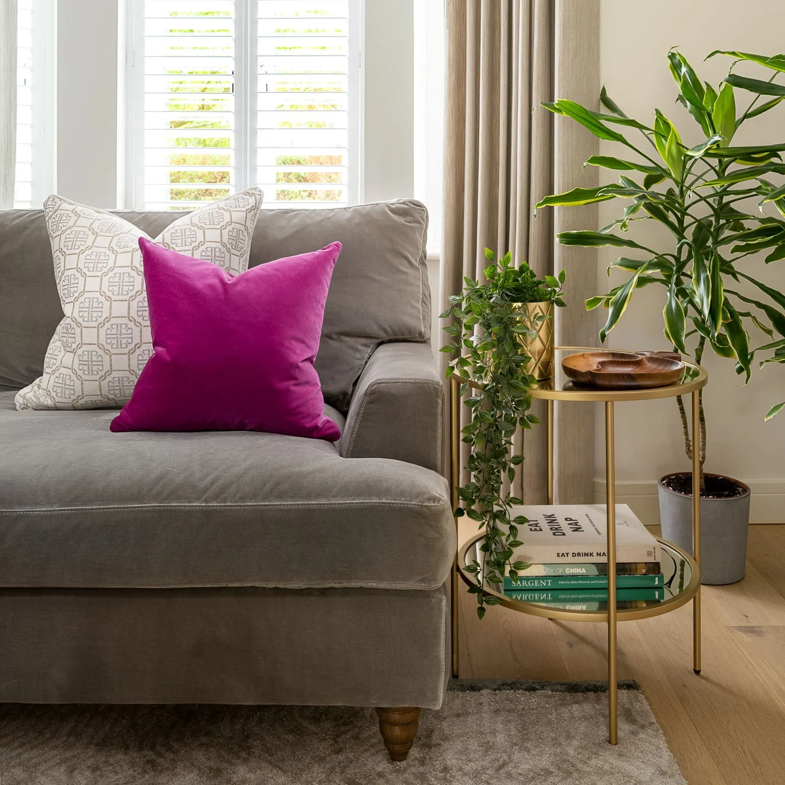
Warm neutrals create a calm, timeless backdrop, but that doesn’t mean a room has to lack personality. Here, natural tones and textures are lifted with greenery, warm brass and a vibrant pop of pink, showing how easy it is to introduce colour into a neutral scheme.
Pink interiors don't have to feel 'pink'
Anyone who knows my work probably won't be surprised to see pink on this list! I love using pink in interiors, but I think people still have lots of preconceptions about what a pink room is going to look like.
Pink doesn't have to be sugary or overtly feminine. Softer, earthier, muddier and plastery pinks can be incredibly sophisticated and can almost behave like a neutral. I love pairing them with greens and blues, natural woods and beautiful textures.
If you don't want pink walls, you can also introduce it in a smaller way. A fabulous pink armchair, painted cabinet, headboard or beautiful fabric can be enough to completely lift a room and give it some personality.
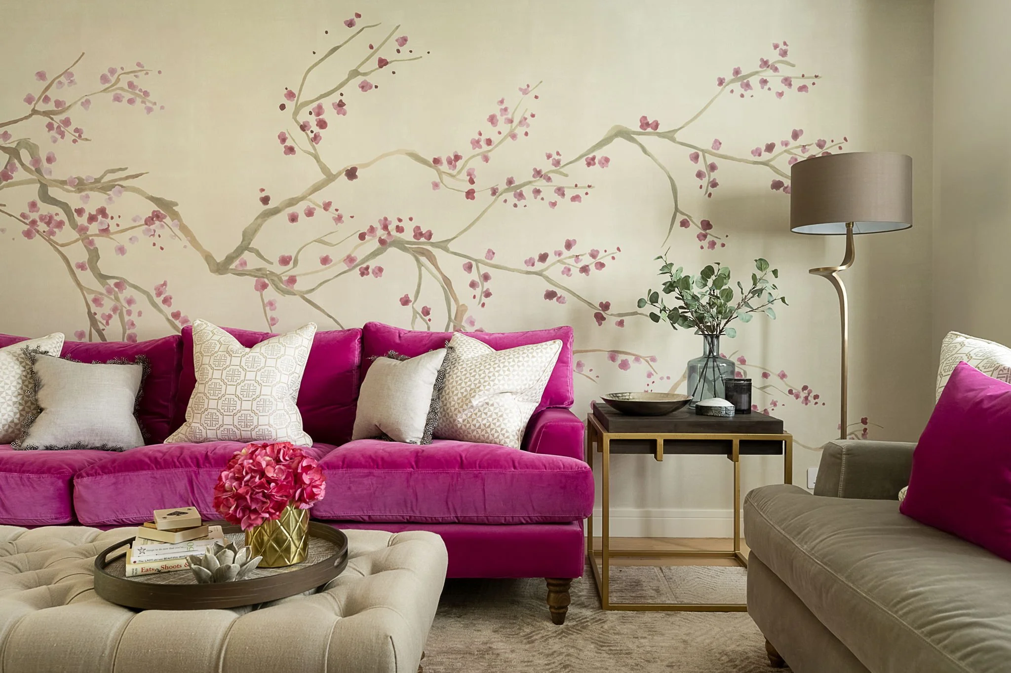
Pink doesn't have to take over a room. Here, a vibrant pink velvet sofa brings personality and energy to a warm neutral scheme, with the delicate blossom mural helping to carry the colour through the space.
Green is one of the easiest colours to live with
If you're nervous about introducing more colour into your home, green is a lovely place to start. We're surrounded by it in nature, which is perhaps why it can feel so easy and restful to live with.
There are also so many different greens to choose from. Soft, muted greens can create a wonderfully calm backdrop, while deeper greens bring richness and character. Green looks gorgeous with warm neutrals and natural timber, but one of my favourite combinations has to be pink and green.
It's a combination that comes up again and again in my work because it gives you colour and personality while still feeling beautifully balanced.

Pink and green is one of my favourite colour combinations, and it doesn’t have to be bold. Here, soft pink cabinetry and walls are layered with fresh green accents and natural wood, creating a warm, calm scheme with plenty of personality.
If you love the idea of bringing more of the colours and textures we see in nature into your home, you might also enjoy my Bringing the Outside In: Nature-Inspired Interiors for a Happier Home blog.
Blue might just be one of the most versatile colours in interiors
Blue has to be one of my favourite colours to use, and if you look through my portfolio you'll probably notice it appears quite a lot! That's because it's incredibly versatile.
From the softest powder blue through to teal, rich inky shades and deep navy, there's a blue for almost every room and almost every feeling you want to create. A pale blue can feel fresh, light and calming, while a teal adds personality and depth. A rich navy or deep blue can make a sitting room or snug feel wonderfully cosy and cocooning.
It also works brilliantly with other colours. I love blue with pink, blue with green, warm natural woods and touches of brass.

Don’t be afraid to commit to a deeper blue. Here, rich blue across the walls, fireplace and joinery creates a wonderfully cocooning feel, while different shades of blue, soft textures, artwork and greenery add depth and keep the room feeling warm and inviting.
People are often quite comfortable choosing a pale blue, but suggest taking a gorgeous deep blue across the walls and woodwork and suddenly it can feel much more daring. Sometimes, though, committing to the colour is exactly what makes the room work.
I've written a whole blog about blue because I love it so much, including lots more ideas for using different shades throughout your home. You can read The Beauty of Blue: How to Create Calm, Style and Timeless Elegance in Every Room.
Should you colour drench a room?
This is another area where clients can get nervous. Painting the walls one colour feels manageable, but painting the walls, skirting boards, doors and perhaps even the ceiling in it can sound like quite a commitment.
In reality, colour drenching can actually make a room feel calmer and more cohesive. Rather than your eye stopping at contrasting white woodwork or a white ceiling, everything flows together. It can be particularly beautiful with deeper colours when you want to create that really cosy, cocooning feeling.
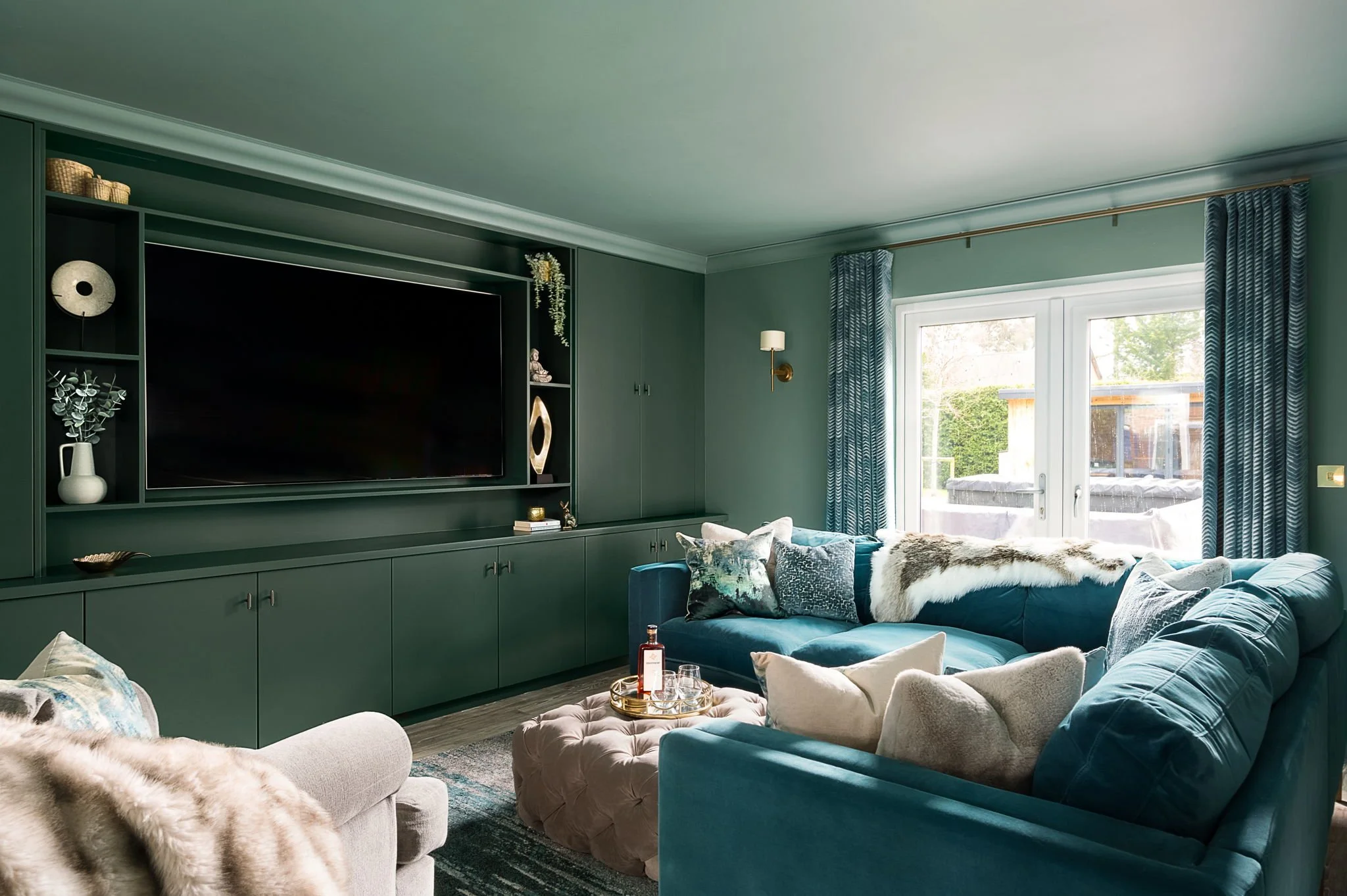
Colour drenching can actually make a room feel calmer and more cohesive. Here, the same rich green flows across the walls and bespoke cabinetry, allowing the joinery to blend into the room rather than compete with it. Layering in teal, soft neutrals and warm metallic details adds depth and keeps the space feeling cosy and inviting.
If you're considering trying it, I've written a separate guide explaining how it works and where I'd use it: The Ultimate Guide to Colour Drenching.
But what if I choose the wrong paint colour?
This is probably the biggest thing that stops people from being more adventurous, and I completely understand why.
You walk into a paint shop and suddenly you're looking at hundreds of tiny coloured squares. Then you start thinking about the direction the room faces, natural light, artificial light, flooring, furniture, undertones and how one room flows into another. That supposedly simple tin of paint suddenly feels like quite a big decision!
But I think there's another risk we don't talk about enough:
The bigger risk can be creating a home that doesn't really reflect you because you've chosen everything based on what's considered 'safe'.
Your home doesn't need to appeal to everybody. It needs to feel like you.
Having worked with colour throughout my career, I've found that the colours people are naturally drawn to are often a much better starting point than whatever shade happens to be trending. Trends can give us inspiration, but I don't think they should dictate how our homes look.
Always test paint colours in your actual room
There is one thing I will always tell my clients: please don't choose a paint colour from a tiny square on a paint chart!
Test it in the actual room and look at it at different times of the day. See what happens in the morning light, later in the afternoon and in the evening when your lamps are on. A colour can change enormously depending on the direction the room faces, the quality of the natural light and all the other colours and materials surrounding it.
This is also why a colour you've seen looking absolutely gorgeous in somebody else's house might not look the same in yours. There isn't one universally 'safe' colour that works everywhere. It's about finding the right colour for your home, your light and you.
Happy homes make happy people
Coming away from Little Greene this week, having seen what's coming next and heard about the incredible amount of thought that goes into creating each colour, made me even more excited about what colour can do in our homes.
There will always be new paint colours and new trends, and yes, there are definitely a few of Little Greene's new colours that I'm already itching to use! But the way I approach colour isn't really about trends at all.
My philosophy has always been happy homes make happy people. I want my clients' homes to feel like them, and the colours we surround ourselves with can have such an impact on how a space makes us feel.
So if you're currently staring at a pile of paint charts wondering, "What colour should I paint my room?", try asking yourself a different question first:
How do I want to feel when I'm in here?
That's where I'd start.
Feeling overwhelmed by paint colours?
If you're decorating or renovating and can't work out which colours will bring everything together, this is exactly the sort of thing we can tackle during one of my Interior Design Consultations.
We'll look at your home, the light, your existing furniture and artwork, the colours you're naturally drawn to and, most importantly, how you want the space to feel. I can then help you create a palette that works together and feels like you, so you can move forward with confidence rather than buying another five tester pots!
Book an Interior Design Consultation
Because your home shouldn't just look lovely. It should make you happy to be there.
